
In today’s competitive e-commerce landscape, a seamless and intuitive online store navigation is paramount to success. Navigation plays a crucial role in shaping the customer experience, influencing conversion rates, and ultimately driving sales. A well-designed online store navigation allows customers to quickly and easily find the products they are looking for, enhancing their overall shopping experience and encouraging them to explore further. This introductory guide will delve into the essential tips and best practices to optimize your e-commerce navigation, transforming it into a powerful tool for business growth. Understanding the key elements of effective navigation is essential for any online store seeking to thrive in the digital marketplace.
This article, “Navigating Success: Tips to Enhance Your Online Store’s Navigation,” offers practical strategies to improve your website’s navigation, boosting user engagement and driving conversions. We will explore the crucial aspects of online store navigation, including clear menu structures, optimized search functionality, intuitive filtering and sorting options, and mobile-friendly design. By implementing these actionable tips, you can create a user-friendly and effective e-commerce navigation system that streamlines the customer journey, encourages product discovery, and ultimately maximizes your online store’s potential.
Understanding the Importance of Intuitive Online Store Navigation
Intuitive navigation is crucial for the success of any online store. It directly impacts user experience, influencing whether visitors stay, browse, and ultimately, make a purchase. A confusing or frustrating navigation experience can lead to lost sales and damage your brand’s reputation.
Easy navigation allows customers to quickly find the products they are looking for. When customers can effortlessly locate desired items, they are more likely to complete a purchase. Conversely, a complicated navigation structure can cause frustration and lead to cart abandonment.
Improved user engagement is another key benefit of intuitive navigation. A well-designed navigation system encourages visitors to explore different product categories and discover related items, increasing their time spent on your site and their potential for making a purchase.
A positive user experience fosters trust and encourages repeat business. When customers enjoy navigating your online store, they are more likely to return for future purchases and recommend your store to others. This positive word-of-mouth marketing can significantly benefit your business growth.
Designing a User-Friendly Homepage Layout
Your homepage is the first impression for many potential customers. A well-designed layout is crucial for grabbing their attention and guiding them further into your store. Prioritize clarity and simplicity to avoid overwhelming visitors.
Feature a clear call to action above the fold. This could be a prominent button leading to a featured product category or a special promotion. Ensure your value proposition is clearly communicated, highlighting what makes your store unique.
Strategic use of whitespace is essential. Avoid cluttering the page with too many elements. Whitespace allows the eye to rest and improves readability. Use high-quality images sparingly to showcase key products or create visual interest.
Consider using a carousel to display featured products or promotions. Keep it concise and avoid overwhelming users with too many rotating items. Ensure the carousel is easily navigable and accessible on all devices.
Creating a Logical and Easy-to-Follow Menu Structure
A well-structured menu is the backbone of effective online store navigation. It guides customers through your product offerings and allows them to quickly find what they’re looking for. A confusing or poorly organized menu can lead to frustration and lost sales.
Categorization is Key: Group similar products into logical categories. Think about how your customers would naturally search for items and structure your menu accordingly. Avoid overly broad or overly specific categories.
Keep it Concise: While comprehensive product offerings are important, a cluttered menu can be overwhelming. Aim for a concise menu structure that highlights key categories and utilizes subcategories effectively. Dropdown menus can be useful for organizing larger product selections.
Clear and Descriptive Labels: Use clear and descriptive labels for each menu item. Avoid jargon or internal terminology that customers may not understand. Labels should accurately reflect the products within each category.
Implementing Effective Search Functionality

A robust search function is crucial for any online store. Effective search allows customers to quickly find the products they desire, significantly improving user experience and boosting sales. Consider these key aspects when implementing search functionality:
Search Bar Placement: Position the search bar prominently, typically in the header of every page. This ensures easy access regardless of where users are on your site.
Autocomplete Suggestions: As users type, offer relevant product suggestions. This feature speeds up the search process and helps guide customers to the right items.
Advanced Search Filters: Enable users to refine their searches by specific criteria such as price range, brand, size, color, and other relevant product attributes.
Handling Misspellings and Synonyms: Implement a search algorithm that can handle common misspellings and recognize synonyms. This ensures customers find products even if they make typographical errors or use different wording.
Search Result Presentation: Display search results clearly, showing relevant product information such as images, titles, prices, and brief descriptions. Allow users to sort results by different parameters like price, popularity, or newest arrivals.
Using Breadcrumbs to Enhance Navigation
Breadcrumbs are a critical navigational aid, offering users a clear path to retrace their steps within your online store. They provide a visual representation of the user’s location within the site’s hierarchy.
By displaying the hierarchical path from the homepage to the current page, breadcrumbs simplify navigation and improve user experience. For instance, a breadcrumb trail might look like this: Home > Category > Subcategory > Product. This allows users to quickly jump back to previous categories without relying solely on the “back” button.
Effective breadcrumb implementation can significantly reduce bounce rates and improve user engagement. When users can easily navigate, they are more likely to explore different sections of your store and ultimately make a purchase.
Key Benefits of Breadcrumbs:
- Improved user experience
- Reduced bounce rates
- Simplified navigation
- Clear website hierarchy
Optimizing Product Category Pages for Seamless Browsing
Effective product category pages are crucial for a positive user experience. A well-structured category page helps customers quickly find what they’re looking for, leading to increased sales and reduced bounce rates.
Begin by organizing products into logical categories and subcategories. Consider how your customers think about your products and group them accordingly. Avoid overly broad categories that contain too many disparate items, as this can be overwhelming.
Filtering and sorting options are essential for narrowing down product selections. Offer filters based on relevant attributes like price, size, color, and brand. Ensure sorting options, such as by price (high to low, low to high), popularity, and newest arrivals, are readily available.
Clear category page titles and descriptions provide context and improve search engine optimization (SEO). Use descriptive language that accurately reflects the products within each category.
Ensuring Mobile Responsiveness for Navigation on All Devices
In today’s mobile-first world, ensuring your online store’s navigation is fully responsive across all devices is paramount. A seamless mobile experience is no longer a luxury, but a necessity for attracting and retaining customers. Failure to prioritize mobile responsiveness can lead to lost sales and damage your brand reputation.
Responsive design automatically adjusts your website’s layout and functionality to fit the screen size of any device, be it a smartphone, tablet, or desktop. This ensures a consistent and user-friendly experience regardless of how customers access your store.
Key considerations for mobile-responsive navigation include simplified menus, easily tappable buttons, and optimized images. Streamlined navigation is crucial on smaller screens. Avoid cluttered menus and prioritize essential navigation elements. Buttons should be large enough to be easily tapped with a finger, eliminating frustration and improving user interaction.
Using Clear and Concise Product Labels and Descriptions
Clear and concise product labels and descriptions are crucial for a positive user experience. Ambiguous or misleading information can frustrate customers and lead to abandoned carts. Ensure your product labels accurately reflect the item being sold.
Use strong keywords in both labels and descriptions to improve search engine optimization (SEO). This will help customers find your products more easily when searching online. Avoid jargon or technical terms that your target audience may not understand.
Brevity is key. While providing sufficient information is important, lengthy descriptions can overwhelm customers. Focus on highlighting the key features and benefits of each product in a succinct manner. Use bullet points or short paragraphs to break up large blocks of text and improve readability.
Maintain consistency across all product labels and descriptions to create a unified brand experience. Establish a clear style guide for product information and ensure it is adhered to throughout your online store.
Incorporating Visual Cues, Such as Icons and Images
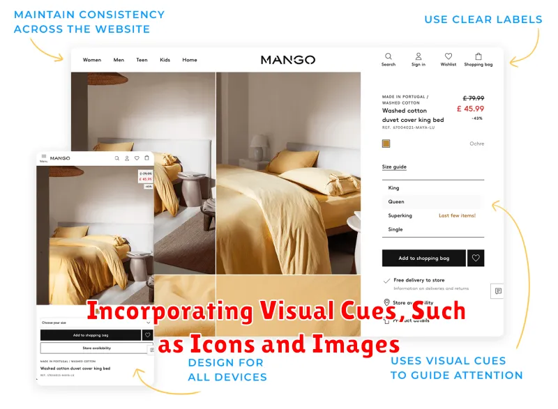
Visual cues play a crucial role in guiding customers through your online store. Icons and images can significantly enhance navigation by providing clear and intuitive direction. Think of them as silent guides, helping shoppers quickly understand where to go and what to expect.
Use icons to represent categories or functionalities. For example, a magnifying glass icon clearly indicates the search function, while a shopping cart icon universally represents the checkout process. Ensure consistency in your icon usage throughout the site. A standardized visual language creates a more cohesive and user-friendly experience.
Images can be effectively employed on category pages to showcase representative products. A small image of a dress on the “Women’s Clothing” category page instantly conveys the category’s content. High-quality images are essential. Blury or pixelated visuals detract from the overall experience and can even give the impression of a less credible site.
Testing and Refining Your Navigation Based on User Feedback
Continuous improvement is key to a successful online store. Gathering user feedback on your site navigation is crucial for identifying pain points and areas for optimization. Various methods can be employed to collect this valuable data.
User testing involves observing real users interacting with your website. This provides direct insights into their browsing behavior and any difficulties they encounter with navigation. A/B testing allows you to compare different navigation structures or elements to determine which performs better in terms of user engagement and conversion rates.
Surveys and feedback forms offer a simple way to collect user opinions and suggestions for improvement. Analyzing website analytics data, such as bounce rates and exit pages, can also reveal potential navigation issues. Heatmaps can visually represent user interaction with your site, highlighting areas of interest and neglect.
Once feedback is gathered, prioritize changes based on their potential impact and feasibility. Implement changes incrementally and continue to monitor user behavior and gather feedback to ensure ongoing optimization.